i never know why such a cool brand like MV Agusta have an uncool logo, so old style and dont represents speed at all… here the old style logo of MV agusta..
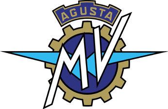
look how complicated the logo.. altough it has been on bikers die hard fans heart for a decade the logo seems way too old and need to be refreshed, the gear shape and wings seems like a logo of a labour organisations, i know that MV agusta started its bussiness on a aviation.. but now its the time for awake.. MV agusta is a brand of a cool motorcycle… 🙂
and i think its the time for MV agusta to move on the next level, cool brand need cool logo, and this is my redesign logo of MV Agusta…

using eurostyle typeface, i choose logotype because it will give the logo looks more modern and clean.
other variants


and logo application on the bike….
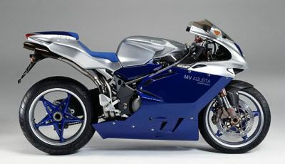
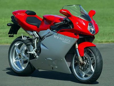
it looks waaayy so modern and clean huh..? 🙂 i really think soo…
now the bikes looks more cool.. 🙂
mv agusta logo pimped by save our design team……